Track testing statuses
Progress Report
To track the progress of more than one test plan or test suite, use the Progress Report. It helps you track the team's progress with respect to planned testing of your product or service by answering the following questions:
- How much testing is complete?
- What is the current status - how many tests have passed, failed or are blocked?
- Is the testing likely to complete in time?
- What is the rate of execution on a daily basis?
- Get a breakdown by test plan and suite to understand where execution is going slow or has many failed or blocked tests.
- View the progress each suite has made within a test plan and identify the areas that need attention.
Configuring the report
By navigating to Test Plans > Progress Report*, you can start using the report. It requires no setup and is applicable for all Azure DevOps Services organizations. When you view the report, it shows you the status of the test plan you had accessed last. However, using the filter bar, you can select one or more test plans in the project.
Understanding the report
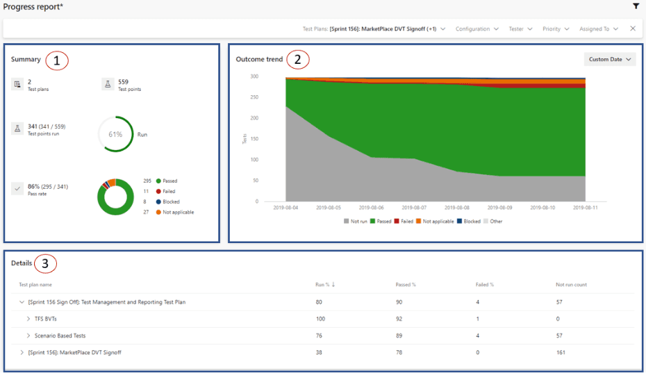
The progress report consists of three sections:
- Summary: This section provides you with a consolidated view for the selected test plans. To understand what test points are, refer here.
- Outcome trend: This graph renders a daily snapshot to give you an execution and status trendline. It can show data for 14 days (default), 30 days, or a custom range of your choice. Data for today may or may not appear in this chart based on the time of the day you are looking at the report.
- Details: This section lets you drill down by each test plan and gives you summary of each test suite in it. The section also lets you navigate to a test plan or suite of choice by double clicking on it.
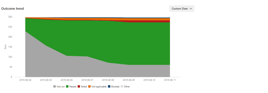
An example of a healthy outcome trend is as follows because as time is progressing, the number of not run tests are decreasing (i.e. tests are being executed) and the number of passed tests are on the rise.
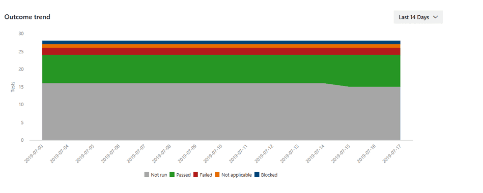
An example of an unhealthy outcome trend is as follows because as time is progressing, there is no significant execution occurring and the # of passed and failed tests are continuing to remain flat. In such situations, use the details card to drill down and take suitable actions.
Filtering
By using the filter bar you can filter this report by Test Suites, Configuration, Tester, Test Case priority, and Test Case Assigned to. As example: you can filter by configuration 'Chrome' and then 'Edge' to understand where the execution and pass % are higher. Note: Tester is the person to whom the test point is assigned for execution whereas Assigned to is the person who is responsible for the reusable test case.
The test plan is considered Level 1. Its child suites are considered level 2. Their child suites in turn are considered level 3. The Test Suites filter shows only the Level 3 test suites inside the selected test plans. To select a Level 2 test suite select all the Level 3 test suites underneath it. This assumes the Level 2 test suites itself does not have any test points.
Behavior
When using this progress report it is good to know the following points:
- The report lets you view data for one or more Test Plans in a single project. To view data across projects, use the OData APIs. This report is also rendered using the same OData APIs.
- Whenever you visit the report, it will show you the data for the test plan you had accessed last. Currently we do not store your last set of filters and also do not let you store an instance of this report.
- All the data shown in the report is as per the current suite hierarchy in the selected test plans. Currently, we are not storing the hierarchy history.
- Data processing for this report is occurring approximately every 15 mins. Do not use this report for real-time analysis or reporting. Expect ~15 mins of duration between a test execution and the same to show up in this report.
- Data for test plans migrated from TFS/Server will not show up in this report. You can leverage this report for test plans created in Azure DevOps Services on or after September 1, 2019.
Provide feedback
Reach us at devops_tools@microsoft.com to share your thoughts on the Progress Report. In the process, share screenshots as appropriate.
Charts
Track testing progress
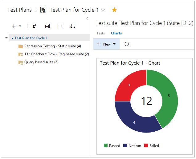
Use test results charts to track how your testing is going. Choose from a fixed set of pre-populated fields related to results. By default, a pie chart is created for each test plan. This chart is grouped by the outcome field to show the latest results for all the tests in the test plan.
View this default chart from the Charts page.
Add your own charts for test results to visualize what's important for your team. If you already know how to add a chart, jump to the examples below of charts that you can create.
Select the test plan or test suite for your chart in the Test Plans page. Then create a new chart.
Select the chart type. Based on the chart, configure the fields that you want to use to group by, or for the rows and columns.
All charts roll up the information for any child test suites of the test plan or test suite that you selected.
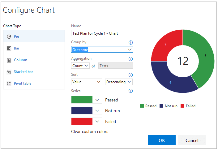
- Save the chart. Now it will be displayed in the Charts page for the test plan or test suite that you selected.
###Test results example**
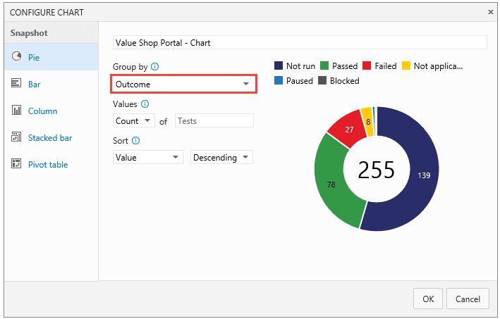
What's the test status for a specific test suite?
Select the test suite from the Test Plans page and add a test results pie chart. Group by Outcome.
####What's the test status for user stories that my team's testing this sprint?
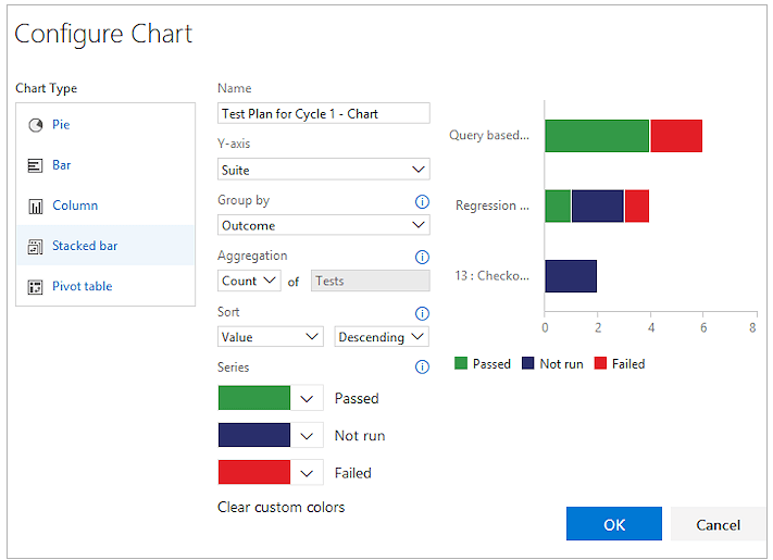
If you have created requirement-based test suites in your test plan for your user stories, you can create a chart for this.
- Group these requirement-based test suites together in a static test suite.
- Select this static test suite in the Test Plans page.
- Add a test results stacked bar chart. Choose Suite as the Y-axis (rows) pivot and Outcome as the Group by (columns) pivot.
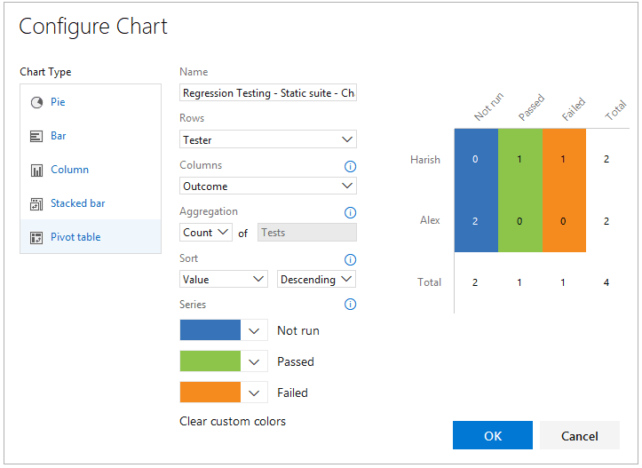
How many tests has each tester left to run?
Select your test plan from the Test Plans page and add a test results pivot table chart. Choose Tester as the rows pivot and Outcome as the columns pivot.
How can I check quality based on the configuration?
Use either a stacked bar chart or a pivot table chart. Choose Configuration as the rows pivot and Outcome as the columns pivot.
How can I track why tests are failing for my team?
For failure analysis, use either a stacked bar chart or a pivot table chart. Choose Tester for the rows and Failure type for the columns. (Failure type for test results can only be set using Microsoft Test Manager.)
How can I track the resolution for failing tests for my team?
For resolution analysis, use either a stacked bar chart or a pivot table chart. Choose Tester for the rows and Resolution for the columns. (Resolution type for test results can only be set using Microsoft Test Manager.)
###Track test case status
Use test case charts to find out the progress of your test case authoring. The charts for test cases give you the flexibility to report on columns that you add to the tests page. By default, test case fields are not added to the view in the tests page.
If you already know how to add a chart, jump to the examples below of charts that you can create for test cases.
- Add any fields you want to use for your test case chart from the tests page with Column options. Then the fields will appear as choices in the drop-down lists for grouping for your test case charts.
- Select the test plan or test suite for your chart in the Test Plans page. Then add a test case chart.
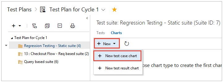
All charts roll up the information for any child test suites of the test plan or test suite that you selected.
- Select the chart type. Based on the chart, configure the fields that you want to use to group by, for rows and columns, or the range (trend charts only).
You can't group by test suite for the test case charts.
- Save the chart. Now it will be displayed in the charts page for the test plan or test suite that you selected.
Test case examples
How can I track burn down for test case creation?
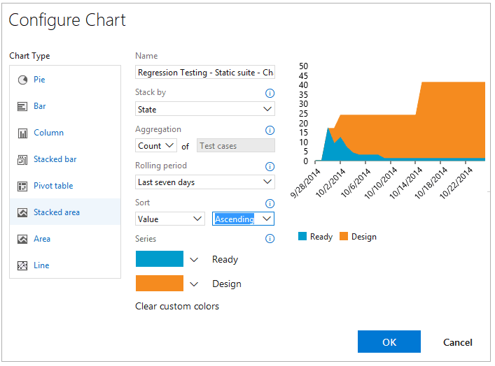
Use a stacked area trend chart to view the burn down for how many test cases are ready to be run. Choose State for the stack by field and Ascending for the sort field.
How can I track burn down for automation status?
Use a stacked area trend chart to view the burn down for how many test cases have been automated. Choose Automation status for the stack by field and Ascending for the sort field.
If multiple teams own test cases in my test plan, can I see how many each team owns and the priorities of the tests?
If your teams are organized by area path, then you can use a test case pie chart. Choose Area path for the group by field.
If you want to know the priorities of these tests, then create a stacked bar chart. Choose Area path for rows and Priority for the columns.
How can I track test creation status by team members?
Test case owners are tracked by the Assigned to field. Use a stacked bar chart or a pivot table chart. Choose Assigned to for rows and status for the columns.
Share charts on your team's dashboard
Pin a chart to your team's dashboard for all the team to view. Use the chart's context menu.
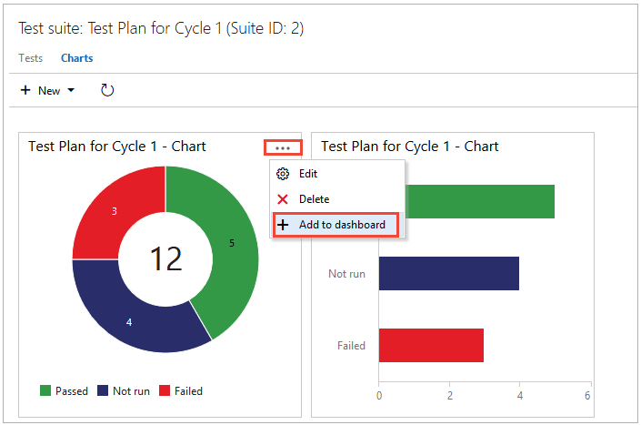
You can configure the dashboard widget to show a range of chart types. You must be a team administrator to do this, but team members with Stakeholder access can view the charts on the dashboard.